
Firebrand Instagram Post
Firebrand is a 24/7 artisan bread bakery founded and rooted in the East Bay. Firebrand specializes in wood-fired bread, pastries, and specialty items. Firebrand has a cafe in Oakland and recently opened a cafe and wholesale bakery in Alameda. They serve a range of items such as breakfast food, pizza, wagyu burgers smoothies, and coffee.
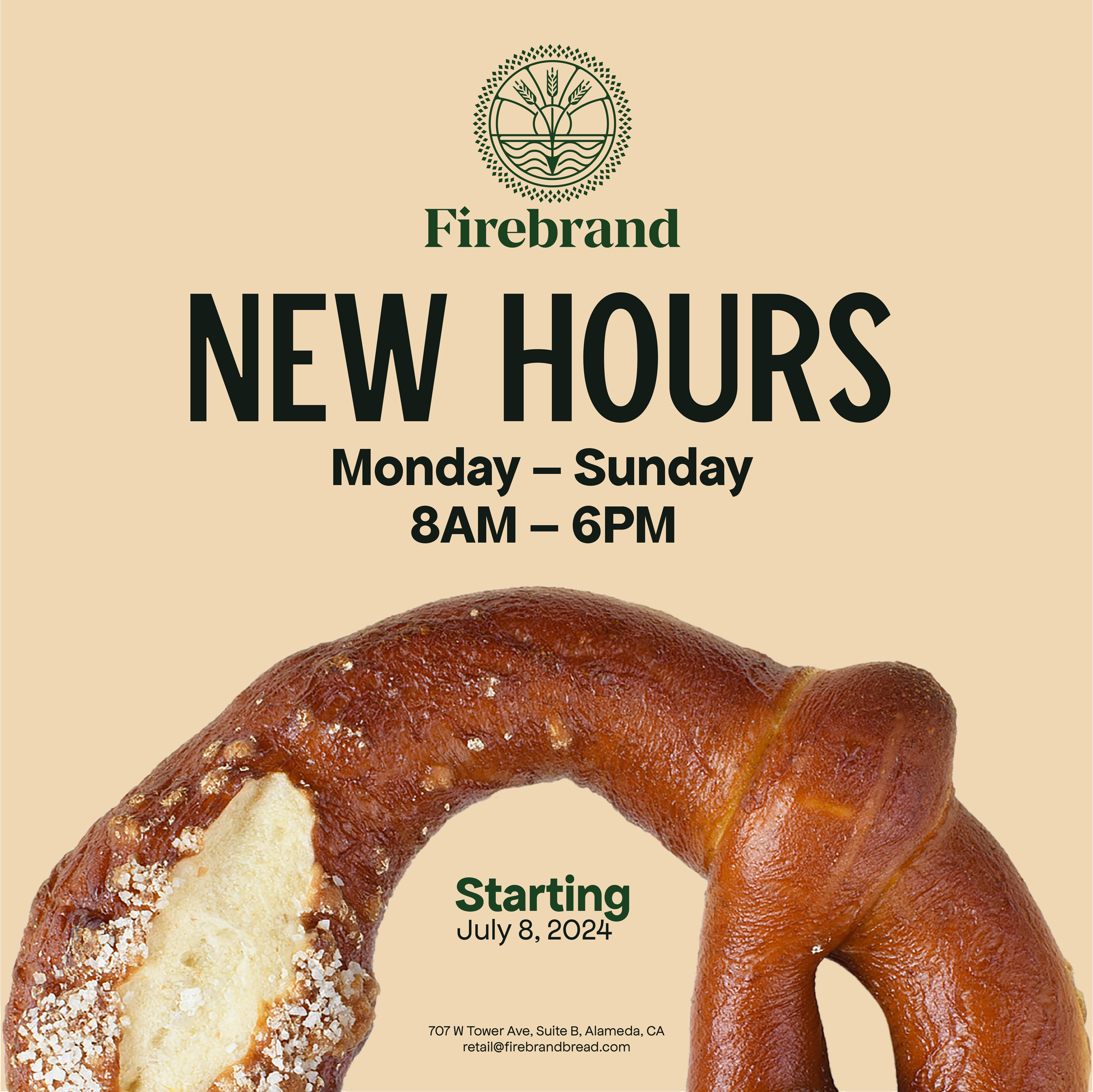
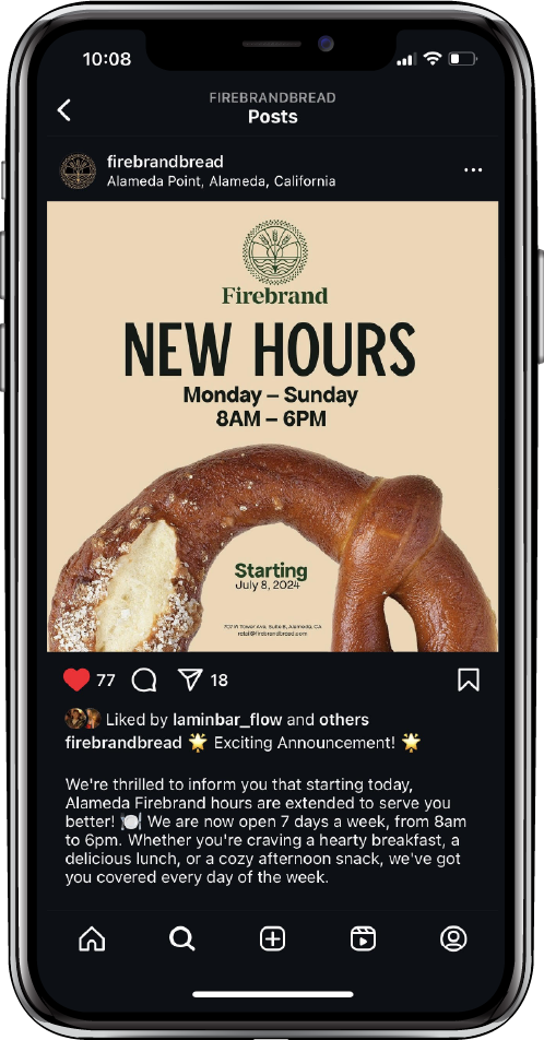
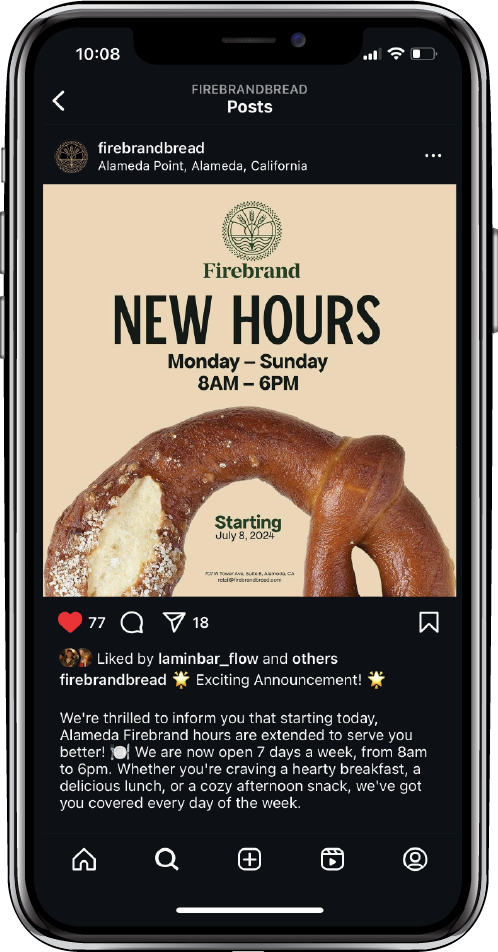
In July 2024, Firebrand Alameda decided to make the big move of being 5 days a week to 7 days a week. To spread the news, it must span through social media. I had the opportunity to create a post for their Instagram of their big announcement. I tried to make an eye-catching post, while staying in the Firebrand styleguide. To make the post eye-catching, I played with typography and photography of Firebrand’s famous pretzel knot. The idea is to be in your face letting the locals know about the big news.

Brand Identity
This cafe brand’s orientation focuses on aiming to make the best bread while building a business that helps people. Their niche is about creating a community.
Their brand colors consist of dark green, hunter green, gold, and cream. The green represents nature while gold and cream resemble the colors of wheat.
Industry
Instagram Post
Service
Typography & Photography
Sketches along the way…
My idea was to make the post loud so that viewers would stop scrolling and be interested in the Instagram post. The pretzel knot is obnoxiously big to make viewers take a second look and ask themselves, “Where have I seen this before?”.
The Pretzel took some time to edit because the color of the original photo was too red paired with the background color. I adjusted the hue and saturation then cropped it through Photoshop. Then I carried the typography work through Indesign.
The target audience for this project is millennials who are Alameda. Most millennials use social media in their free time as a way to catch up with their friends and companies online. Instagram is a perfect place to make announcements.
The typography I used follows the brand’s guidelines. Since the motion of swiping on Instagram is up and down, I tried to keep the typography’s composition in a bilateral style; centered. I wanted to keep the flow of the movement of where the fingers would go.

Thumbmail sketches of different ideas. I played with composition, layout, negative and positive space using different types of bakery goods from Firebrand.