
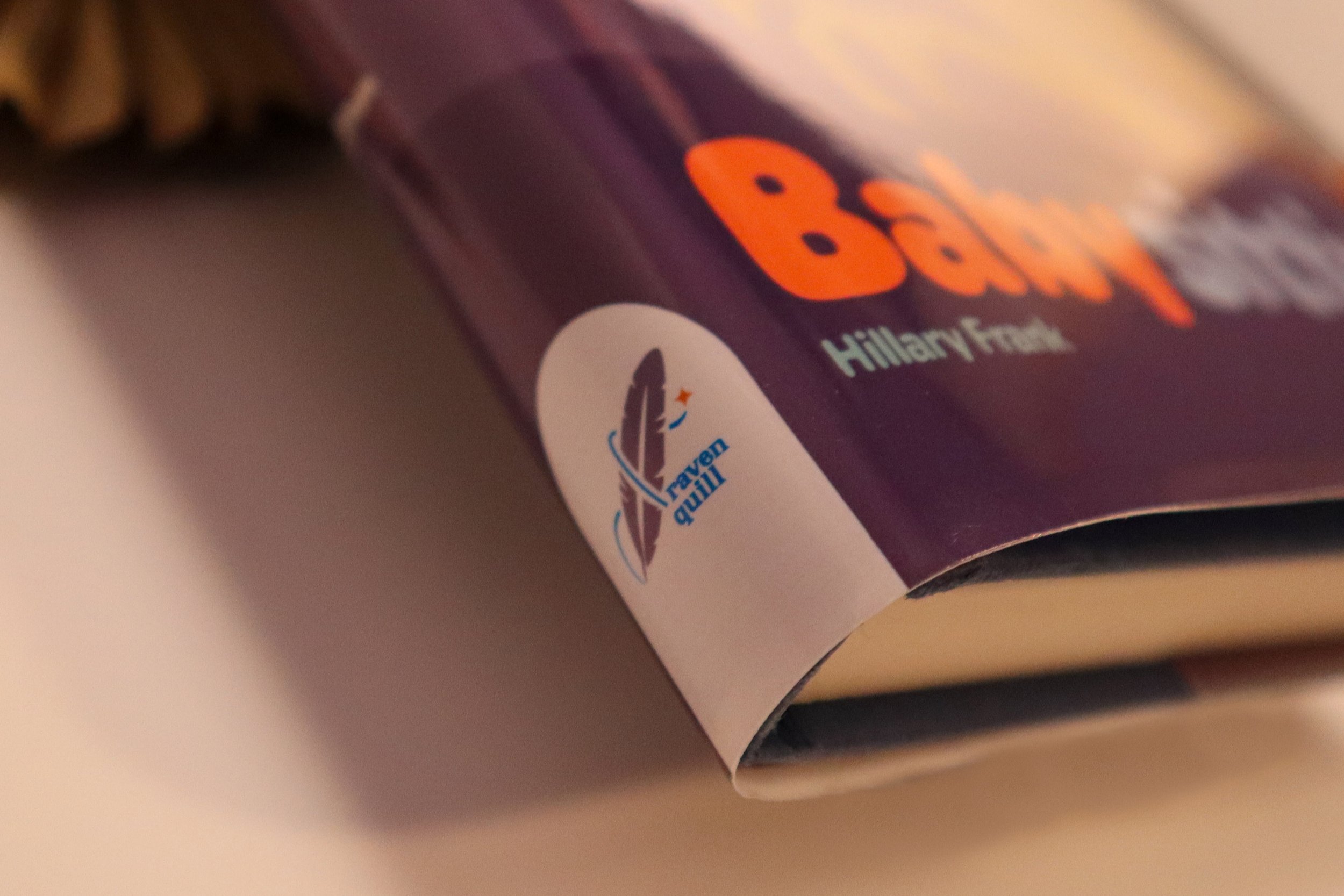
Raven Quill: Babysitting
Raven Quill is a book publishing company based in the Bay Area featuring their newest book, Babysitting by Hillary Frank. The prompt for this project is to redesign a story based on its genre. The genre I was assigned was comedy and irony. The challenge was creating a product following a prompt, staying within guidelines, and remaining original and creative.
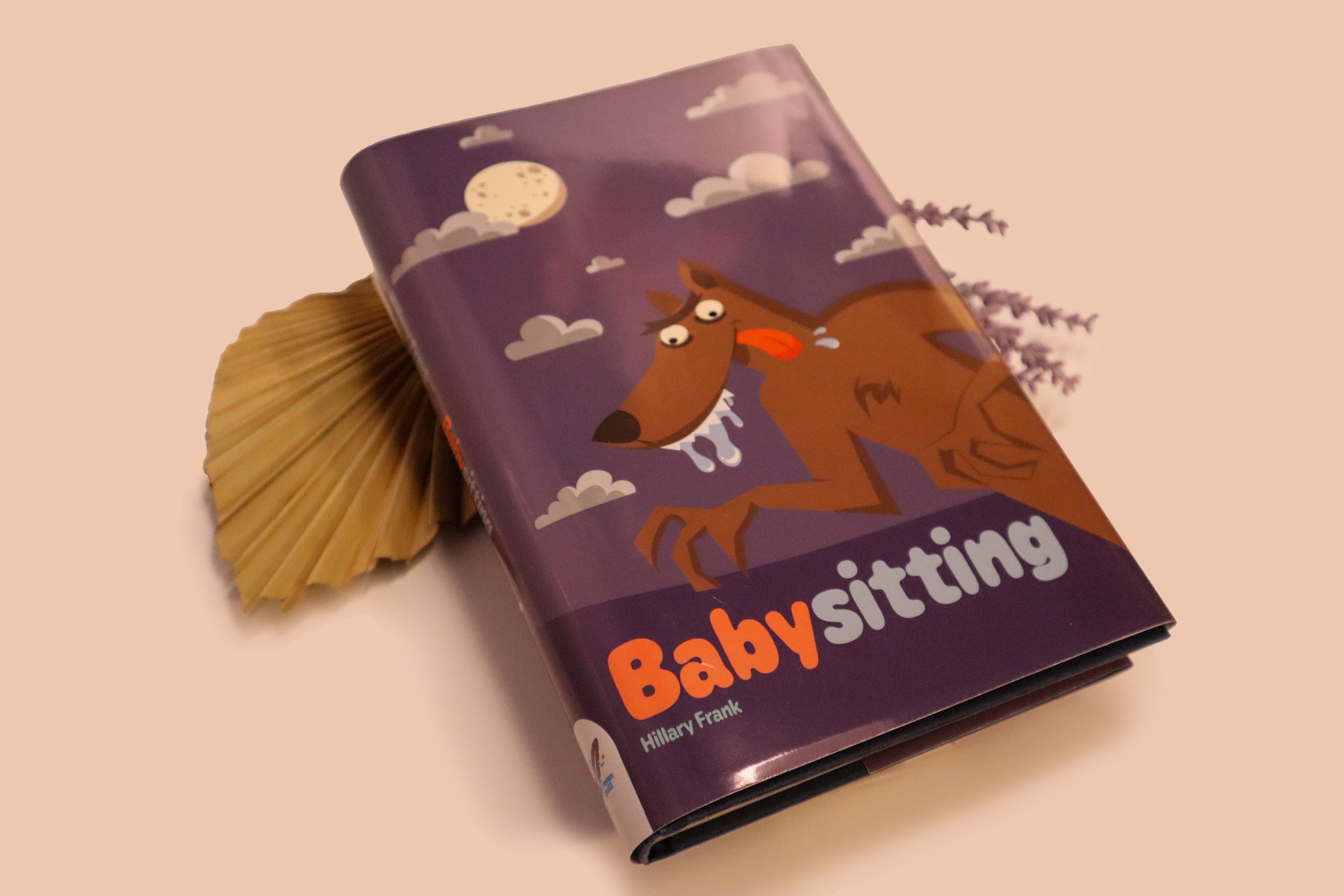
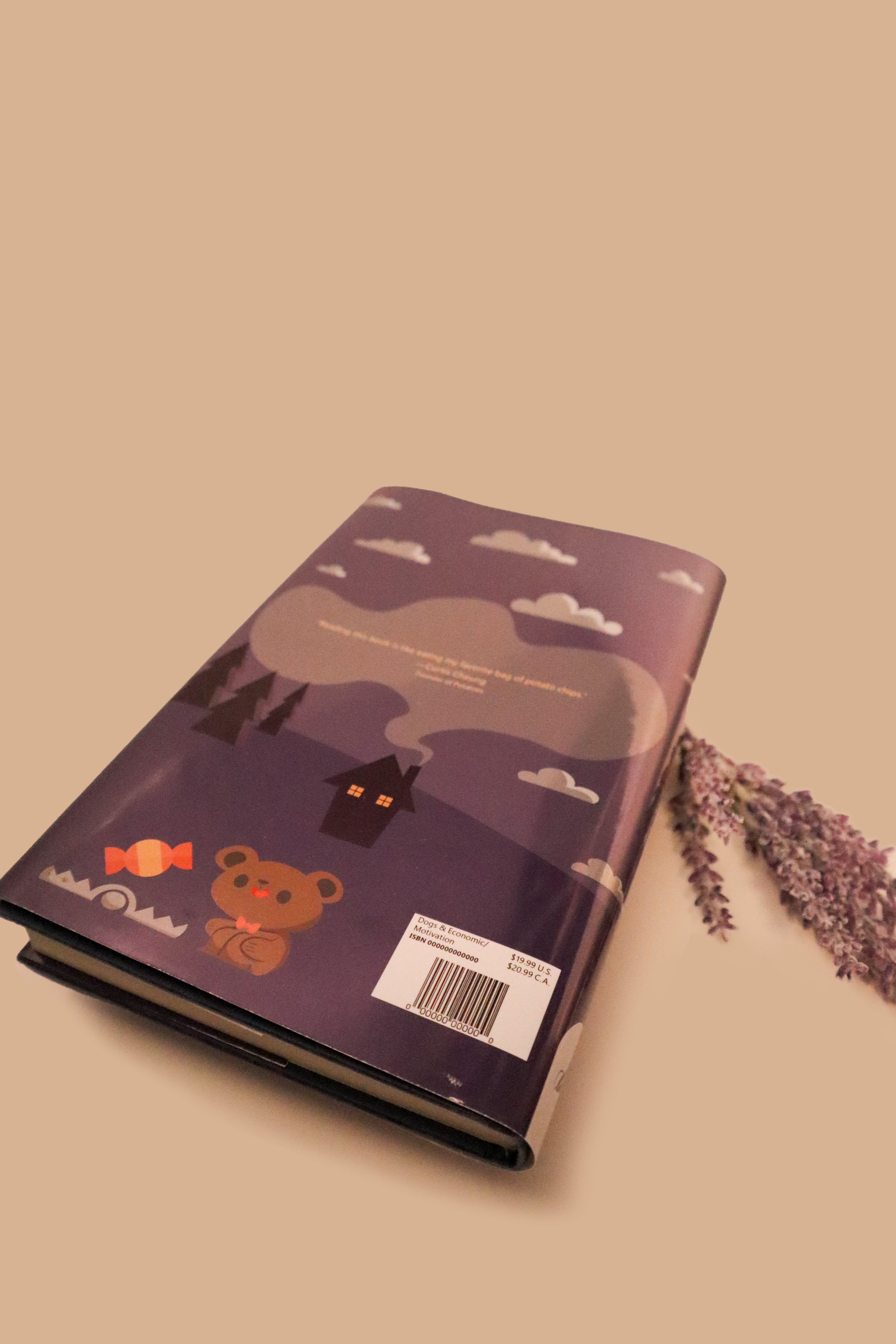
The story is about a babysitter who was a big bully to his younger siblings. The wolf on the cover is portrayed as the oldest brother and the bear represents the younger naive brothers. The oldest brother likes to play pranks. In one scenario, he tricked his siblings into thinking he was a werewolf and that he was going to eat them. As they grew into adults, the babysitter had a son who took after his dad’s devious traits as a child.
I was drawn to this project because it offered a unique opportunity to reinterpret a story based on its genre—in this case, comedy and irony. The challenge of redesigning within specific guidelines while staying original and creative intrigued me. The prompt inspired me to take a fresh, unexpected approach by transforming the book cover into something reminiscent of a children's book but with an adult twist, aligning with the story's ironic tone.
My logo design was voted by my class to be used for our book brand publisher.


Brand Identity
Raven Quill is a book publishing company based in San Francisco. It embodies and becomes emblematic of the symbol of the Raven Quill. The logo symbolizes intelligence, wisdom, and curiosity. The publishing company will cover a wide spectrum of literature genres.
Raven Quill uses 3 colors: Purple, orange, and blue. Purple represents the air of mystery and the unknown of stories. Blue represents limitless reading and freedom. Orange is a good complementary color that brings in energy and warmth. The logotype works best with white and neutral backgrounds for contrast.
Industry
Book publishing + book design
Service
Branding


Providing clear visuals and measurements, help the viewers to see how our logos should be reinforced. The X provides a visible clear space on how much room is required using the width of “q” in quill as a base model. The minimum space required for the logo should be 0.5 inches.
Sketches along the way…
I have created many variations of the logo. Eventually, these ideas would be narrowed down to one draft and then into a final piece. I played a lot with the placements and the color palette.
I originally had a gradient effect, but opted out for solid colors. I was always drawn to these three colors because of how good they look together. Eventually, I put a style guide together for the class to use.
For the book cover design, I came up with four different ideas with strong symbolism of child youth and metaphor. I visualized a lot of children’s toys such as blocks and teddy bears, an umbrella that symbolizes babysitting, and the bad werewolf. I leaned toward the werewolf because it resonated with the story the best.

Raven Quill logo digital sketch and drafts.

The “don'ts” apart of the Raven Quill style guide.

The four different sketch ideas for the Babysitting book cover.


Book cover sketches of the werewolf and bear in depth.

The first draft for the Babysitting book cover.